Portfolio


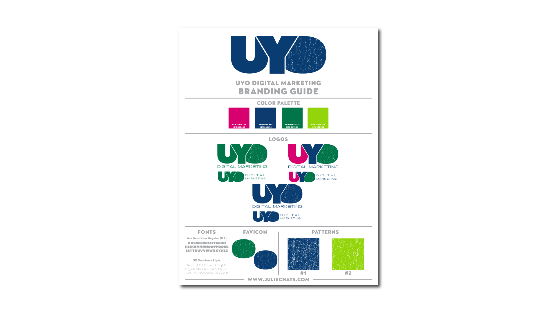
The UYO Digital Marketing branding is a rebranding project for an established business. The goal was to bring more personality to the brand while projecting feelings of knowledge and trust, as well as an injection of fun. This design shows the unique approach of a passionate founder giving a nod to where she's come from - in the shape of the O and the color green (University of Oregon). The use of the tech-related pattern shows the inter-connectedness innate to web development and its associated services provided by the agency.

LET'S CREATE TOGETHER
Contact Us
Thank you for contacting us.
We will get back to you as soon as possible.
We will get back to you as soon as possible.
Oops, there was an error sending your message.
Please try again later.
Please try again later.